


 support@brosisco.store
Table of Contents
- Why Personalized Gifts Can Look Cheap
- Common Mistakes When Ordering Custom Gifts
- The Role of Material Quality in Avoiding Tacky Designs
- Elegant Font Choices for Engraving
- Sophisticated Personalized Gift Ideas That Feel Intentional
- Photo Quality and Resolution Requirements
- DIY vs. Professional Customization
- Conclusion
Last Updated: August 29, 2026
Why Personalized Gifts Can Look Cheap
The difference between a thoughtful gift and a tacky one often comes down to restraint. Most people assume more personalization equals more meaning, they're wrong. Adding your name, date, initials, and a sappy quote to every available surface doesn't make a gift personal; it makes it look mass-produced in the worst way.
When you layer customization after customization, treating the item like a canvas for every sentiment you can think of, the result feels cluttered and cheap, not because of the base product, but because design choices overwhelm it. The most meaningful gifts feel intentional, not desperate. They suggest the giver took time to consider what would resonate, rather than throwing everything at the wall.
BroSisCo's curated selection of personalized jewelry and keepsakes starts from this principle: less is often more when avoiding tacky personalized gift designs. The real challenge isn't finding a place that offers customization, it's finding one that understands when to stop.
Common Mistakes When Ordering Custom Gifts
Over-Customization and Visual Clutter
The biggest mistake when ordering custom gifts is treating personalization like a feature checklist. If you can engrave it, embroider it, add a monogram, include a date, and stamp a message, you should do all of those things, this thinking is exactly backward.
Over-customization creates visual clutter that undermines the entire gift. A minimalist approach, choosing one or two meaningful personalization elements and executing them perfectly, communicates sophistication. A simple necklace with a single meaningful initial engraved in elegant serif font reads as intentional and timeless. The same necklace covered in engravings, dates, and symbols reads as desperate, regardless of material quality.
When shopping for personalized gifts, look for options where customization complements the base design rather than competing with it. A monogrammed leather journal with subtle, well-placed initials feels premium; one where personalization dominates the cover feels cheap.
The fix is simple: choose your single most meaningful personalization element and commit to it fully. Skip the rest.
Prioritizing Quantity Over Quality
Another common mistake surfaces when people prioritize having multiple customization options over the quality of execution. They'll choose a vendor offering five different engraving styles over one offering three styles executed flawlessly.
A poorly executed serif font looks worse than a beautifully executed sans-serif. A rushed engraving on cheap material screams "mass-produced," while thoughtful engraving on quality material whispers "curated."
When ordering personalized gifts, quality of materials matters as much as the personalization itself. High-quality materials elevate even simple personalization. The vendors worth your time understand that a single, perfectly executed design choice beats multiple mediocre ones. BroSisCo's approach reflects this philosophy: each piece is selected for material quality first, then personalization options are carefully considered to complement rather than overwhelm.
The Role of Material Quality in Avoiding Tacky Designs
Material quality is non-negotiable when avoiding tacky personalized gift designs. The finest engraving on cheap metal still looks cheap. Premium materials, even with simple personalization, automatically feel more intentional.
Many gift-givers focus entirely on personalization and overlook the foundation. A personalized gift is only as good as the item being personalized. If the base product feels inexpensive or poorly made, customization won't fix it.
When evaluating personalized gift options, start by assessing material quality. Look for solid metals rather than plating, genuine leather rather than synthetic, and natural wood rather than particleboard. These materials develop character over time, reinforcing the sense that the gift is a keepsake, not a disposable item.
A personalized bracelet in solid silver feels like a heirloom. The same design in plated metal feels like costume jewelry. The personalization might be identical, but the perceived value and longevity are completely different.
Elegant Font Choices for Engraving
Serif vs. Sans-Serif for Personalized Items
Font choice is one of the most underrated decisions in personalized gift design and one of the easiest ways to tip a gift from "elegant" to "tacky."
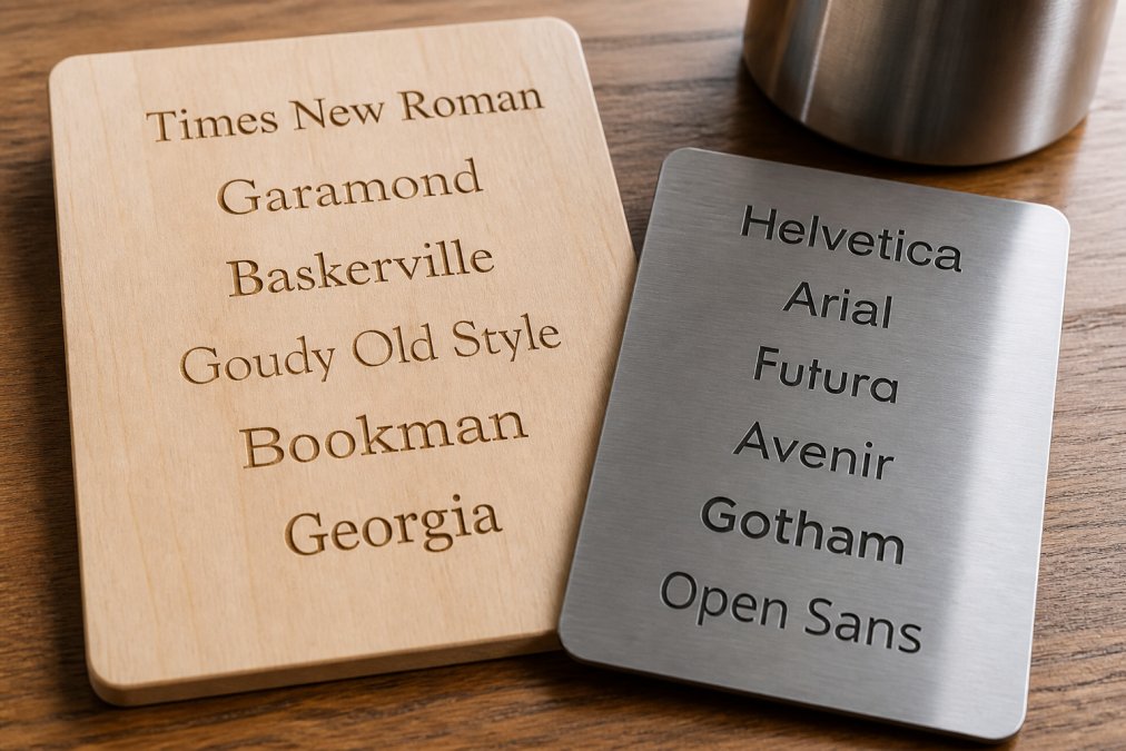
Serif fonts, with small lines extending from letter edges, read as traditional, sophisticated, and timeless (apa.org). They're the default choice for formal engraving because they convey craftsmanship and intentionality. Sans-serif fonts can work for modern, minimalist designs, but they require more restraint. Paired with excessive personalization, they often read as casual rather than timeless.
The mistake most people make is choosing a decorative or script font, thinking it adds personality. Decorative fonts are the fastest path to tacky personalization. They date quickly, are harder to read when engraved, and signal "I didn't think about this carefully."
For avoiding tacky personalized gift designs, stick with classic serif fonts for formal items and clean sans-serif for modern pieces. Avoid script, decorative, or novelty fonts entirely.
Sizing and Spacing Matter
Even with the right font, poor sizing and spacing can destroy the elegance of personalized gift designs. Text that's too large overwhelms the item; text that's too small looks cramped. Inconsistent spacing makes everything feel amateurish.
When a vendor prepares your personalization, ask to see a mockup or proof. Check that text is proportional to the item, that there's breathing room around it, and that spacing between letters is consistent.
Poor spacing is particularly common with monograms. Letters crammed together look cheap; proper spacing looks intentional. This detail separates professional engraving from rushed work. Typography hierarchy matters too, if personalizing with both a name and date, the name should be slightly larger and more prominent, creating visual balance.
Sophisticated Personalized Gift Ideas That Feel Intentional
Minimalist Design Principles for Timeless Gifts
Minimalism applied to personalized gifts means choosing items where customization enhances the design rather than dominating it. A minimalist personalized gift typically features one or two customization elements executed with precision: a leather journal with a single initial embossed on the cover, a bracelet with a meaningful date engraved inside, or a wooden box with a name inlaid in contrasting wood.
Recipients perceive minimalist personalization as more thoughtful because it suggests the giver understood the item well enough to know what would enhance it. When shopping for personalized gift options, look for items with clean lines, neutral colors, and simple forms, ideal canvases for subtle personalization.
The challenge is resisting the urge to add more. The most elegant personalized gifts are often the ones where you actively chose what NOT to personalize. This restraint separates curated, intentional gifts from mass-produced-feeling ones.
Subtle vs. Loud Customization
Subtle personalization is barely noticeable at first glance but meaningful once discovered: an engraving on the inside of a ring, a monogram embroidered in matching thread color, or a date stamped inside a leather wallet. These reward close inspection and feel like secrets between giver and recipient.
Loud customization dominates the visual landscape and, ironically, makes personalization feel less meaningful because it's trying so hard to be noticed. For avoiding tacky personalized gift designs, err toward subtle every time. The most meaningful gifts feel personal without being obvious about it.
BroSisCo's curation of personalized jewelry and keepsakes reflects this understanding: the best personalization feels like it was always meant to be there, not something added as an afterthought.
Photo Quality and Resolution Requirements
If personalizing a gift with a photo, a custom mug, photo book, or printed keepsake, image quality makes an enormous difference in how the final product looks.
Low-resolution photos will print with visible pixelation, blurriness, or graininess, immediately making the gift look cheap and homemade. High-resolution photos print crisply and look professional.
Before uploading any photo for personalization, check the resolution. Most vendors require at least 300 DPI (dots per inch) for print-quality results (iso.org). A phone photo might be 72 DPI, fine for screens but terrible when printed on a physical gift (peer-reviewed research). Use the highest-quality original photo you have. If you only have a low-resolution version, consider whether photo-based personalization is the right choice.
DIY vs. Professional Customization
DIY personalization offers control and can feel more personal, but unless you have actual design and execution skills, it often looks amateurish. Hand-painted lettering that's uneven, crooked engraving, or embroidery with inconsistent tension immediately make the gift feel homemade in a way that undermines its value.
Professional customization is executed by someone with the skills and equipment to do it right. A professional engraver produces consistent, clean results. A professional embroiderer understands tension and stitch quality. The trade-off is cost and trusting someone else with your vision, but results are almost always worth it.
For most people, professional customization is the better choice, particularly when ordering from a vendor specializing in personalized gifts. They've already vetted design choices, material quality, and execution standards.
Checking Spelling and Data Accuracy
A personalized gift with a misspelled name or wrong date doesn't just look tacky, it looks careless. It suggests the giver didn't care enough to double-check. For a keepsake, this is particularly damaging.
Before finalizing any personalization, verify every detail. Check spelling multiple times. Verify dates. Confirm that names are spelled as the recipient prefers. Most reputable vendors provide a proof or mockup before production. Use this opportunity to catch errors. A few minutes of careful checking now saves embarrassment later.
When shopping for personalized gifts that feel sophisticated rather than tacky, remember that restraint is your best tool. Choose high-quality materials, limit personalization to one or two meaningful elements, and execute those elements with precision. Avoid visual clutter, decorative fonts, and the temptation to customize every available surface.
At BroSisCo, we understand that the best personalized gifts feel like they were always meant to be that way. Our curated selection of personalized jewelry, home goods, and keepsakes is chosen specifically for material quality and design intentionality. We handle personalization with the care it deserves, ensuring your gift arrives looking thoughtful, not tacky. Shop our collection of sophisticated personalized gift ideas and discover how intentional design makes all the difference.
Frequently Asked Questions
What makes a personalized gift look cheap or tacky?
Tacky personalized gifts typically suffer from over-customization, poor material quality, low-resolution photos, and clashing design elements. When every inch of an item is covered with text, images, or embellishments, it creates visual clutter rather than intentional design. Mass-produced aesthetics, mismatched fonts, and low-quality engraving finishes also signal low craftsmanship. The most sophisticated personalized gifts embrace minimalism, quality materials, and restrained customization that feels curated rather than chaotic.
How do I choose a font that looks elegant on custom gifts?
Select serif fonts like Garamond or Caslon for timeless, sophisticated engravings on jewelry and keepsakes. Sans-serif fonts work well for modern, minimalist designs but should be paired with generous spacing and appropriate sizing. Avoid decorative or script fonts unless they're part of a curated, intentional design. The key is ensuring readability and visual balance, oversized text or cramped lettering undermines elegance. Test the font at actual size before ordering to verify it maintains clarity and craftsmanship on the final material.
Are photo-heavy personalized gifts usually considered tacky?
Photo-heavy designs often feel mass-produced and lack intentional curation. High-resolution photos can work beautifully when used sparingly and paired with quality materials, but multiple images or low-resolution images create visual clutter and cheapen the overall aesthetic. The most sophisticated approach uses a single, high-quality photo or combines it with minimalist typography and ample negative space. Focus on one meaningful image rather than filling every available surface, which helps the gift feel like a thoughtful keepsake rather than a novelty item.
What are common mistakes when ordering custom gifts?
The biggest mistakes include over-customizing with too much text or imagery, choosing low-quality materials to save money, neglecting to check spelling and data accuracy before ordering, and ignoring how the design will look on the actual product. Many people also select fonts without considering how they'll appear at the intended size or material. Skipping a visual checklist before finalizing your order leads to regrettable results. Professional customization services help avoid these pitfalls by providing design guidance and quality control that DIY options often lack.
This article was written using GrandRanker


